.gif)
.gif)
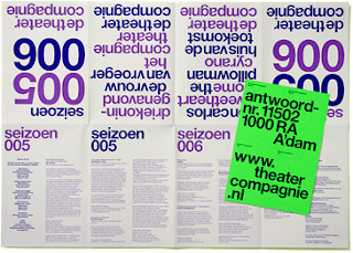
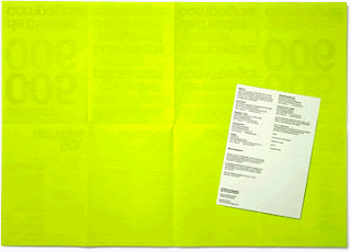
So after spending most of yesterday watching Helvetica and all its extras, which are almost as good as the movie itself, I thought I would check out some of the work by the designers featured in the film. I came across the website for Experimental Jetset which, although it hasn't been updated for a while, has some really good content on it , talking you through in great detail a lot of there projects up until 2005. While being a brilliant resource it also helps you understand the process and thinking behind a lot of their work.

Coming from from a pretty different end of the design spectrum I got out "Hand Job" from the library. I am really into hand lettering and would like to incorporate it into my work more, However I have come to realise that it is incredibly time consuming and not appropriate for a lot of projects. I think in the future this will probably make up more of a hobby rather than a central part of my practice. Here are a few pages that initially caught my eye.


Everyone has seen the Sagmeister piece on the left, But the one on the right where the lettering is made up from bacteria would have been interesting and appropriate for the 'bacteriologist' mail shot brief.


Finally here are some of my designs for the speaking from experience brief. I wanted to incorporate photography and hand lettering. I don't know if I've set myself too bigger task and I don't really know how appropriate hand lettering or photography is to my chosen subject which is Ways to relax without getting wasted. Anyway I've tried to base all the hand lettering on an appropriate source and tried to get the photography right. This is where I am at, at the moment, the idea is that these would be A2 posters.
 Here I based the typography for "eat out" on the typography on the window of Cafe Rouge which you can actually see in the photo which is clipped into the type (click the image to see it larger). This idea of European cafe culture i.e. drinking and coffee and maybe and glass of wine kinda of relaxing and treating yourself rather than getting drunk was quite appropriate.

I didn't base this typography on a specific source, however i tried to play around with the copy height to give the type a jarring unpleasant feeling kind of like how it feels to be in college with a particularly nasty hangover. I set it in caps to emphasise the how loud and overbearing things can seem in that situation.

Well that was pretty long I have been meaning to do a proper post here for a while now. Until the next time. Bye!
No comments:
Post a Comment